Comparing regions: maps, cartograms and tree maps
Last week I attended a seminar where a talk was given about the economic opportunities in the SAAAME (South-America, Asia, Africa and Middle East) regions. Of course a map was shown with those regions highlighted. The map was not that disimilar to the one below.
library(RColorBrewer)
library(rworldmap)
data(countryExData)
par(mai=c(0,0,0.2,0),xaxs="i",yaxs="i")
mapByRegion( countryExData,
nameDataColumn="GDP_capita.MRYA",
joinCode="ISO3", nameJoinColumn="ISO3V10",
regionType="Stern", mapTitle=" ", addLegend=FALSE,
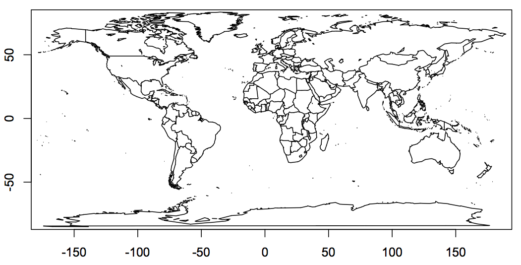
FUN="mean", colourPalette=brewer.pal(6, "Blues"))It is a map that most of us in the Northern hemisphere see often. However, it shows a distorted picture of the world.
Greenland appears to be of the same size as Brazil or Australia and Africa seems to be only about four times as big as Greenland. Of course this is not true. Africa is about 14 times the size of Greenland, while Brazil and Australia are about four times the size of Greenland, with Brazil slightly larger than Australia and nine times the population. Thus, talking about regional opportunities without a comparable scale can give a misleading picture.
Of course you can use a different projection and XKCD helps you to find one which fits your personality. On the other hand, Michael Gastner and Mark Newman developed cartograms, which can reshape the world based on data [1]. Doing this in R is a bit tricky. Duncan Temple Lang provides the Rcartogram package on Omegahat based on Mark Newman’s code and Mark Ward has some examples using the package on his 2009 fall course page to get you started.
A simple example of a cartogram is given as part of the maps package. It shows the US population by state: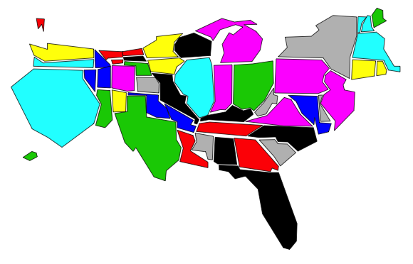
library(maps)
map('state.carto', fill = TRUE, col = palette())
The output looks certainly nice and interesting and cartograms appear to be popular. Aon Benfield used cartograms in their recent insurance risk study report to display the different risks around the world. Yet, I wonder how much information I actually gain from those plots.
A great example of a functional map is still Harry Beck’s map of the London Tube. It works because it is not trying to plot the stations where they actually are. Location has been sacrificed for readability with great skill.
I have to come back to the land area. 71% of the world’s surface is water. We only live on the remaining 29%. The maps don’t suggest this to me. The shape of a region or where it is located on the world is not as important as the relativities between them to get this message across. Wouldn’t a simple tree map be a much better choice?
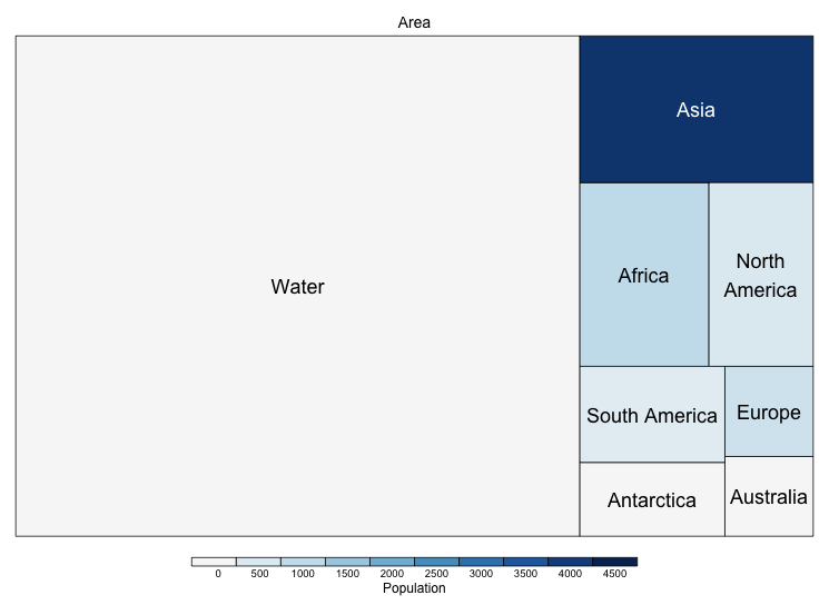
PopAreaByContinent <- structure(list(
  Continent = structure(c(3L, 1L, 6L, 7L, 2L, 5L, 4L, 8L),
             .Label = c("Africa", "Antarctica", "Asia",
                        "Australia", "Europe", "North America",
                        "South America", "Water"),
             class = "factor"),
  Area = c(43820000, 30370000, 24490000, 17840000, 13720000,
           10180000, 9008500, 360637100),
  Population = c(4164.252, 1022.234, 542.056, 392.555,
                 0, 738.199, 29.127, 0)),
                .Names = c("Continent",  "Area", "Population"),
                 row.names = c(1L, 2L, 3L, 4L, 5L, 6L,7L, 9L),
                 class = "data.frame")

library(treemap)
tmPlot(PopAreaByContinent,
       index="Continent",
       vSize="Area",
       vColor="Population",
       fontsize.labels=c(18))
If in doubt, always remember Carl Sagan: We live on a small pale blue dot in the universe. That’s all.
References
[1] Diffusion-based method for producing density equalizing maps, Michael T. Gastner and M. E. J. Newman, Proc. Natl. Acad. Sci. USA 101, 7499-7504 (2004)
Update, 10 April 2013
Test your understanding with the Mercator puzzle.
Session Info
R Under development (unstable) (2012-10-19 r60974)
Platform: x86_64-apple-darwin9.8.0/x86_64 (64-bit)

locale:
[1] en_GB.UTF-8/en_GB.UTF-8/en_GB.UTF-8/C/en_GB.UTF-8/en_GB.UTF-8

attached base packages:
[1] grid  stats  graphics  grDevices utils  datasets  methods   base

other attached packages:
 [1] rworldmap_1.02     fields_6.6.3       spam_0.29-1    maptools_0.8-14
 [5] lattice_0.20-10    foreign_0.8-51     sp_0.9-99      treemap_1.1-1
 [9] data.table_1.8.4   RColorBrewer_1.0-5 maps_2.2-6
Citation
For attribution, please cite this work as:Markus Gesmann (Dec 11, 2012) Comparing regions: maps, cartograms and tree maps . Retrieved from https://magesblog.com/post/2012-12-11-comparing-regions-maps-cartograms-and/
@misc{ 2012-comparing-regions-maps-cartograms-and-tree-maps,
author = { Markus Gesmann },
title = { Comparing regions: maps, cartograms and tree maps },
url = { https://magesblog.com/post/2012-12-11-comparing-regions-maps-cartograms-and/ },
year = { 2012 }
updated = { Dec 11, 2012 }
}