Waterfall charts in style of The Economist with R
Waterfall charts are sometimes quite helpful to illustrate the various moving parts in financial data, particularly when I have positive and negative values like a profit and loss statement (P&L). However, they can be a bit of a pain to produce in Excel. Not so in R, thanks to the waterfall package by James Howard. In combination with the latticeExtra package it is nearly a one-liner to produce a good looking waterfall chart that mimics the look of The Economist:
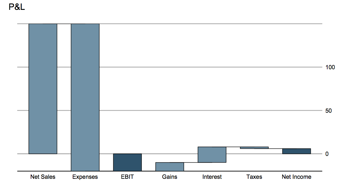
Waterfall chart
library(latticeExtra)
library(waterfall)
data(rasiel) # Example data of the waterfall package
rasiel
#    label          value   subtotal
# 1  Net Sales       150    EBIT
# 2  Expenses       -170    EBIT
# 3  Interest         18    Net Income
# 4  Gains            10    Net Income
# 5  Taxes            -2    Net Income

asTheEconomist(
               waterfallchart(value ~ label, data=rasiel,
                              groups=subtotal, main="P&L")
               )
Of course you can create a waterfall chart also with ggplot2, the Learning R blog has a post on this topic.
Citation
For attribution, please cite this work as:Markus Gesmann (May 07, 2012) Waterfall charts in style of The Economist with R. Retrieved from https://magesblog.com/post/2012-05-07-waterfall-charts-in-style-of-economist/
@misc{ 2012-waterfall-charts-in-style-of-the-economist-with-r,
author = { Markus Gesmann },
title = { Waterfall charts in style of The Economist with R },
url = { https://magesblog.com/post/2012-05-07-waterfall-charts-in-style-of-economist/ },
year = { 2012 }
updated = { May 07, 2012 }
}